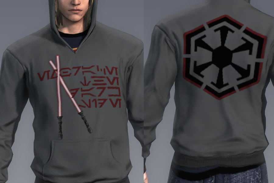
Re: APB Hoodie
God, I always wanted them to release JUST the design creator so I could use it for inspiration once I got a new sewing machine.
Just for the record, i still think mines prettier :P
I like it...
looks like we have a guild clothing designer :P

Also, from what I've read so far, speeder training (mount) costs 40k, the speeder itself, 8k, add the cost of skill training and gearing up...it just makes more sense to take slicing to lvl 50, to bring in the credits. After 50, reskill and powerlvl your chosen crafting very quickly.
Anyways thats what I plan to do, the crafting mat swap thing sounds awesome and could work with with my plans too. :)
People scoff when I say that Mitt Ronmey will get the GOP nomination.
But, it's things like this show why.
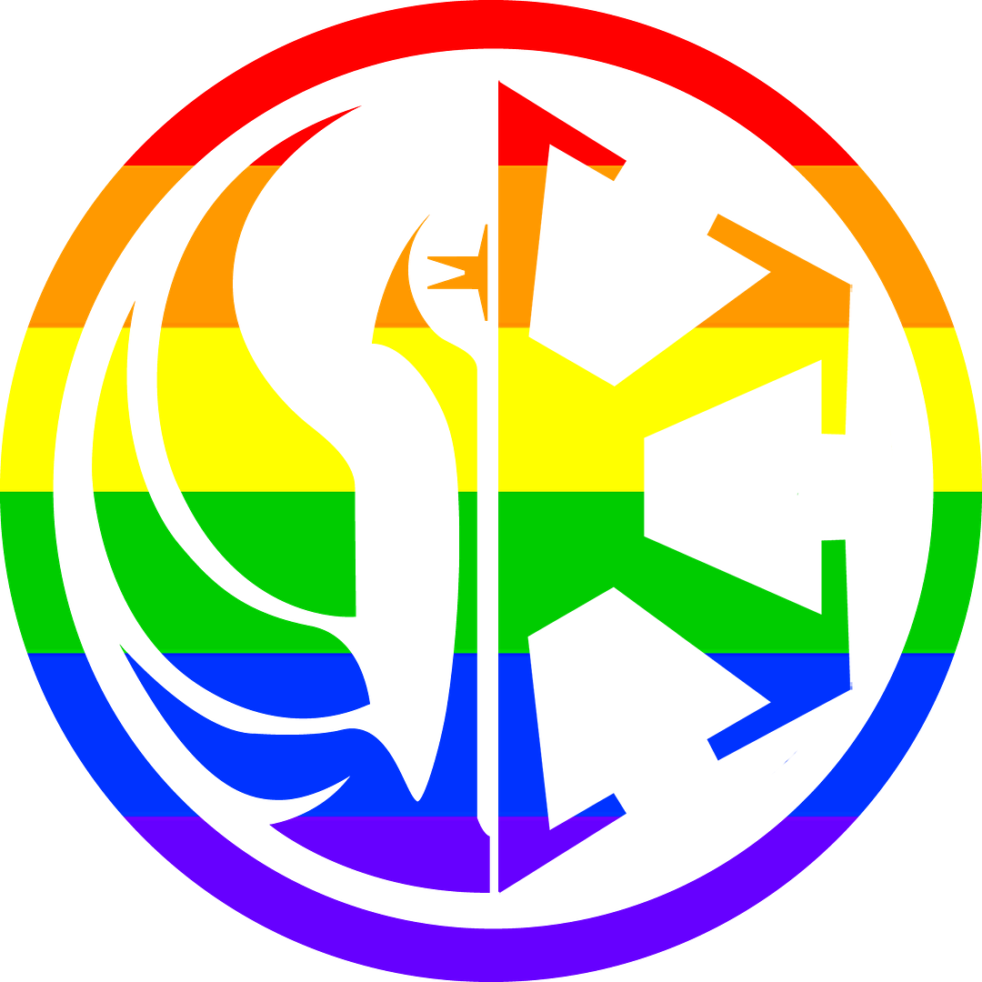
I have a big pet peeve. I find it very annoying when people use a gradient in place of the Rainbow Flag. It bothers me to the very core and I find it utterly hideous.
Case in point:[attachment=606]gay_gradient.png[/attachment]
Isn't it awful?
The Rainbow Flag is made of 6 (Not 7 or 8, turquoise and hot pink were dropped for good reason. Get over it people.) stripes of red, orange, yellow, green, blue and purple and in that order![attachment=609]gay_flag.png[/attachment]
The Rainbow flag incorporates the three primary and secondary colors. This provides the complimentary color (the secondary color) for each primary color which helps the piece look more vivid and bright. As well, the different stripes help provide balance through the entire flag. The gradient mean while just looks plain awful.
I use Firefox and I never ever have had a problem with it for years. Tried clearing my cache, and it still didn't work. Anyway, I tried it with IE and it worked so go figure.
Thanks for your help guys :)
She wasn't always like this. BUT I'll take the new one over the old one.